Part 1: from TrueType GX to Variable Fonts.
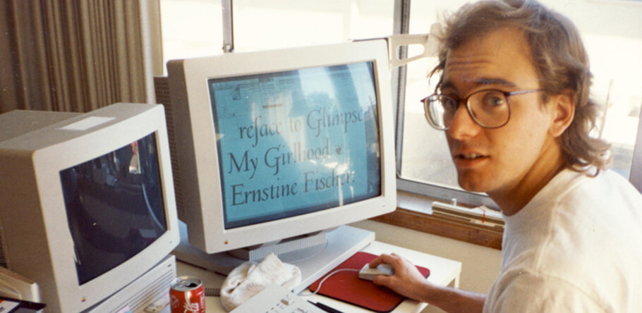
Tom Rickner, veteran type designer, shares his personal role in the beginnings of type’s most exciting development in decades.
In August of 2016, four unlikely collaborators in the world of type, fonts and font technology stood on a stage at the ATypI conference in Warsaw, Poland. The collaborators were Apple, Microsoft, Adobe and Google. Together they announced the publishing of OpenType 1.8, an update to the now ubiquitous font standard which was originally an amalgam of Apple & Microsoft’s TrueType, and Adobe’s PostScript font formats.
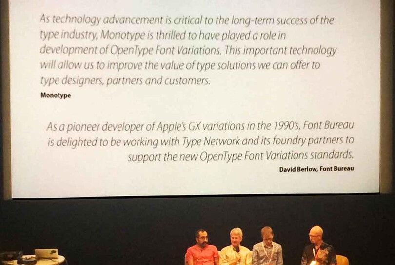
The OpenType 1.8 announcement, ATypI, Warsaw, Poland, September 14, 2016
OpenType 1.8 unveils tremendous new powers of control for type designers, typographers and application developers alike, and it will do so on each of the major operating systems. For those of you who remember Adobe’s Multiple Master format, that technology represented a sliver of the capabilities that will be at your disposal within the new OpenType standard.
There were numerous reasons that this announcement was unique, and many have written about this news in these past few months. But for me, the announcement was not only the culmination of months of meetings, private discussions and collaboration with industry colleagues, but it was in fact the rebirth of one of my first collaborations in the font software business, some 25 years earlier.
During the late 1980’s and early 1990’s I was a member of the TrueType team at Apple, working within the “Blue” system software group that released the revolutionary System 7 for the Macintosh. It was that post-Sculley, pre-return-of-Steve-Jobs period when industry prognosticators regularly foretold of the doom of Apple. But while much of the code written back then has vanished from today’s MacOS, from the kernel and graphics libraries to the print drivers and application suites that use them, one of the significant bodies of work that has survived to this day is TrueType, and many of the fonts on which I had worked.
When Apple announced their intent in 1989 to develop a system-level font format, they were not greeted warmly by application developers or even users, many of whom had grown fond of their growing font libraries as provided by Adobe, Bitstream, Compugraphic, Linotype, Monotype and others. And of course Adobe, whose PostScript page description language was instrumental in the Macintosh’s success as a desktop publishing platform, was particularly aggrieved by Apple’s new competitive stance. Apple’s selling of their Adobe stock, and the announcement of TrueType, née Royal, was the first shot fired in what became known as the Font Wars.
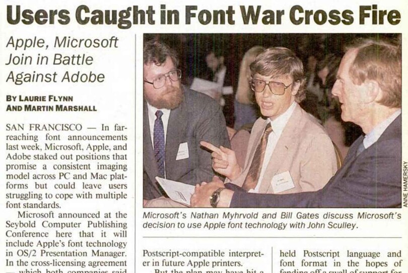
This headline was taken from InfoWorld, September 25, 1989
Some questioned Apple’s motivation to part company with John Warnock and friends. To be sure, making outline type an integral part of a computer operating system was a revolutionary concept at the time. While we now take it for granted, it was Kathryn Weisberg, visionary and leader of the TrueType team at Apple that had realized as Matthew Carter had once stated, “type should be part of the body of the computer, and not just the clothing which it wears”.
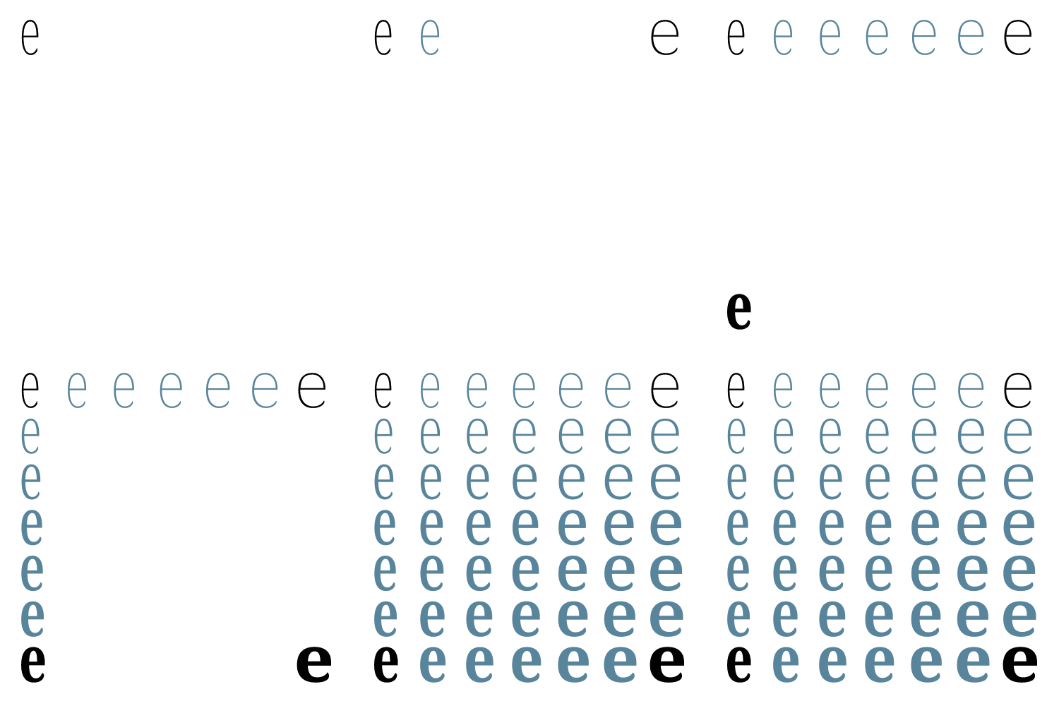
Demo of how Adobe‘s 1989 Multiple Masters concept worked.
Adobe did not sit idly by during this period. Just 2 months before Apple was able to ship a TrueType enabled System 7, Adobe announced Multiple Masters. With this format, a designer would draw the extreme combinations in each “axis of variation”, shown here in black, and the user could then interpolate intermediate designs within this design space, such as those shown in blue.
Adobe’s idea, or should I say Director of Typography, Sumner Stone’s idea, to interpolate outlines from different weights or styles of typefaces to create new weights, wasn’t in itself a new idea. Peter Karow at URW had first done this sort of thing with Ikarus technology in the 1970’s. But the idea to enable this capability within the type rendering engine, was very exciting, and definitely a first. Learning of this announcement was, I think, more than a little disheartening to the TrueType team at Apple.
Mike Reed was a key member of this TrueType team. He worked on the font tools and the glue code in TrueType. He wrote RoyalT, the first TrueType font editor which allowed us to view, and more importantly, instruct TrueType fonts. But most of all, I think he really was the heart and soul of the team. Ever optimistic, always creative, he really was great fun to work with.
As we looked at Multiple Masters, the first thing we all realized was that Adobe was not drawing or storing data for the primary, or the default font in the family. Since it interpolated from extreme values, the designer had to draw the shapes that define the outer edges of the design space, as we’ve previously seen. Mike thought a more useful approach would involve starting with the primary weight, or another existing weight or style, since these fonts already exist, and in our case they were already instructed in TrueType. And the type folk all agreed.
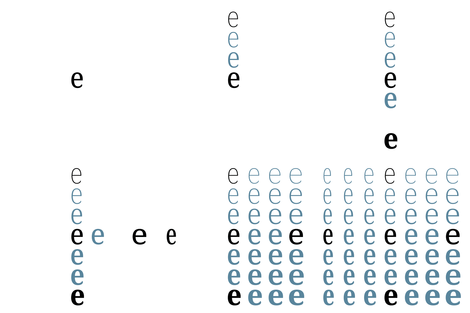
Demo of how Variable Fonts work with arbitrary directionality.
Our initial attempts to create variations from a default font were to use the TrueType instructions themselves. The thinking was that most of the features we wanted to vary between (a Regular and a Bold, or a Regular and a Condensed) were captured in the instructions that controlled elements like stem weights, serif lengths and thickness, heights and alignments, and so on. But while we could create variants that looked bolder, or more condensed, the designers among us always wanted to tweak something in the shape in a way that the basic TrueType instructions did not allow.
Then Mike considered the Delta instruction. One of the unique attributes of the TrueType Delta instruction, is that it works with arbitrary directionality. So the instruction doesn’t only work in the X direction or the Y direction, but instead can be applied parallel or perpendicular to any two points in a glyph’s outline, or on computed angles for that matter.
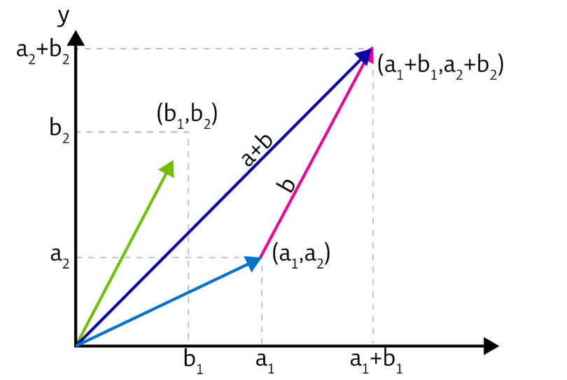
Frank D and Nykamp DQ, “Vectors in two- and three-dimensional Cartesian coordinates.”
Mike took this idea and applied it to the variations we were trying to create now, and realized that the difference in location of a point in a bold font, as related to a regular, is simply a vector. And vectors can be added together. So if we think of these vectors which describe a variation of a glyph as being stored on a Cartesian plane, and we consider the design axes themselves being on a Cartesian plane, we realize that we can add variations together.
This new approach to storing outlines that represent a design space was incredibly powerful, and broke down some significant barriers and limitations in Adobe’s approach. But superior technology is not enough to succeed, as any aficionado of Betamax will atest. TrueType GX never caught on, for reasons too numerous to cover here. However, not catching on is not the same as dying. In fact, the TrueType GX Variations technology has continued to ship on the Mac for the past 25 years, as can be seen in Matthew Carter’s Skia font.

Matthew Carter’s Skia font is a variable font that’s been shipping on the Mac for the past 25 years.
It is the revival and the expansion of this revolutionary technology that brought everyone together long before the ATypI announcement in August. My colleague Dave Opstad and I were fortunate enough to be a part of these discussions given our intimate knowledge of the original work, as well as our current work in providing font tools for our type designers and font producers at Monotype. For my part, beyond the original collaboration with Mike Reed, I had helped make Skia, and had designed and built the Buffalo Gal typeface, one of the first GX sample fonts for a developer CD. Dave was a key figure at Apple during this time as well, working on the line-layout portion of GX as well as working on Apple’s tool suite for building variations fonts.
While the announcement represents what I truly believe has been an unprecedented degree of collaboration across the industry, there is still much work to be done. For this to become a reality, we need updates to operating systems, applications, web browsers, CSS standards and many smaller details. However I share the optimism of many in those meetings and the external parties who support this work and believe that Variable Fonts will succeed this time around.
For our part, Monotype is working closely with all the key stakeholders: operating system developers, type designers and font tool developers, to build the infrastructure for producing and delivering variable fonts that solve real world problems.
While the initial use of this technology was focused on packaging a wide range of styles into a single file, other use cases are far more intriguing, from optical size axes, to responsive typography, to delivering different grades or weights across different platforms to normalize output between multiple devices.
We will be sharing more of our thoughts and research on this in the coming days, weeks and months. We hope you will follow along, and join the conversation. Ask us questions, and let us know how you’d like to use variable fonts in your work @TrueTyper #VariableFonts
About Tom
Tom Rickner’s career in type spans nearly 3 decades. During that time he has mastered nearly every aspect of type design and font production, from his earliest days editing bitmaps, to designing some of the very first Multiple Master fonts for Adobe and TrueType GX Variations fonts for the Font Bureau and Apple. Although he is likely most well known for his hinting of Matthew Carter’s Georgia, Verdana, Tahoma and Nina typefaces for Microsoft, Tom’s real expertise is found at the intersection of design, tools and technology related to fonts. He is currently the font tools product owner at Monotype, where he works to improve the lives of type designers and font producers by defining and guiding the development of better tools and processes to meet their ever changing needs.


