Neue Haas Unica™
Sélection naturelle typographique.
Découvrez, gérez et utilisez des polices avec votre abonnement.
Achats de polices individuels pour tout projet.
Découvrez, gérez et utilisez des polices avec votre abonnement.
Achats de polices individuels pour tout projet.

Sélection naturelle typographique.
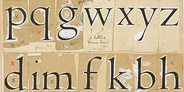
Neue Haas Unica™ is Monotype’s revival of a typeface that has attained almost mythical status in the type community. Unica® was an attempt to create the ultimate sans-serif – a hybrid of Helvetica, Univers and Akzidenz Grotesk. Designed by Team ’77 and released to great acclaim in 1980, Unica went missing under a heap of legal disputes and has never been available as a full, digital typeface. Until now.

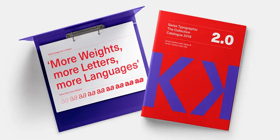
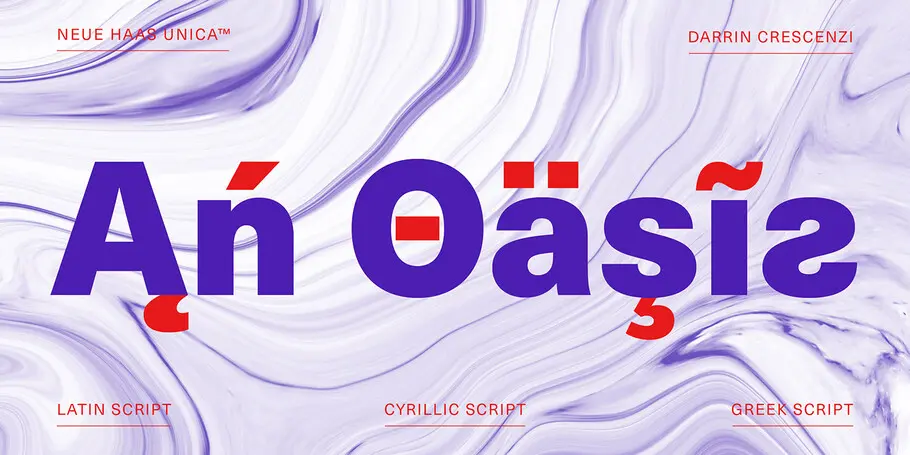
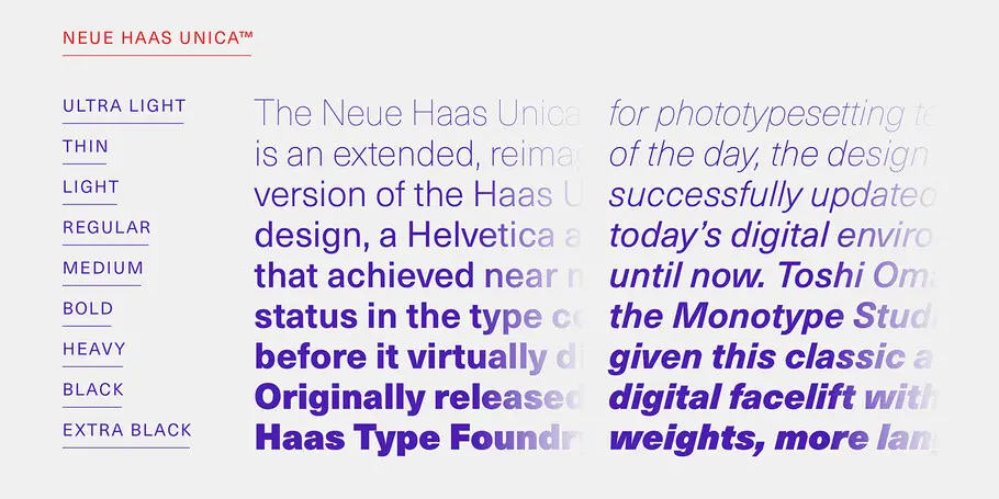
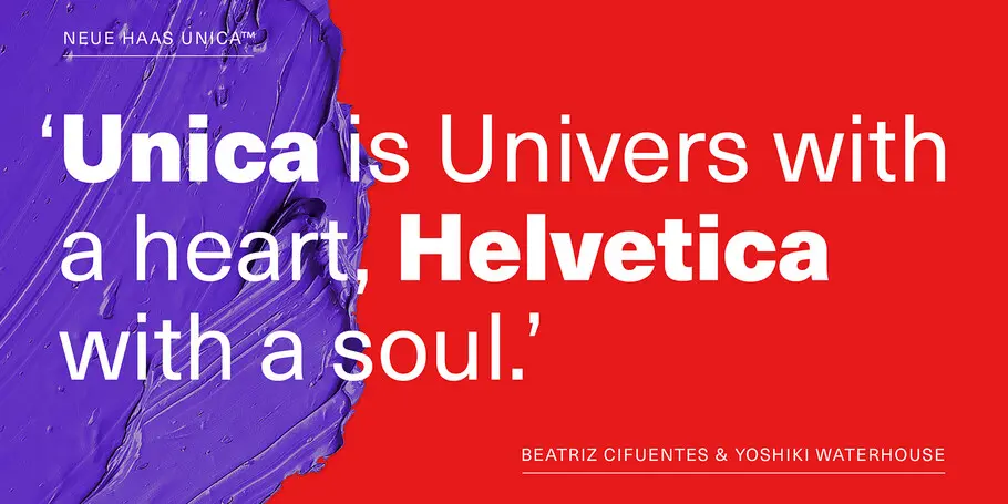
Neue Haas Unica™ is Monotype’s revival of a typeface that has attained almost mythical status in the type community. Unica® was an attempt to create the ultimate sans-serif – a hybrid of Helvetica, Univers and Akzidenz Grotesk. Designed by Team ’77 and released to great acclaim in 1980, Unica went missing under a heap of legal disputes and has never been available as a full, digital typeface. Until now.
Unica’s story starts in the 1970s. Electronic, on-screen phototypesetting was gaining popularity, but most sans-serif typefaces on the market had been designed earlier, in the era of metal type. The revered Haas Type Foundry in Münchenstein, Switzerland, saw the chance to develop a new sans-serif face that was optimized for the new technology and filled the gap in the market. To develop their new product, they turned to Swiss type design trio, Team ’77 (André Gürtler, Christian Mengelt and Erich Gschwind).
Team ’77 set out to design a font based on Helvetica but drawing on other sans-serif typefaces, principally Univers. The name they gave it would also be a hybrid of the two.
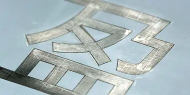
They went about the task with forensic rigour. Working from prints of Helvetica, Univers and Akzidenz Grotesk, the trio identified, compared and evaluated the finest of details, creating a new-generation sans-serif that eliminated the imperfections of its predecessors. “Unica was designed to be different,” said André Gürtler; “sharper than Helvetica, warmer than Univers, cleaner than Akzidenz.”
Released in 1980, Unica hit the sweet spot. It was clean, understated and elegant. But it found only limited success. Desktop publishing software rendered phototypesetting obsolete. Unica became entangled in a dispute over ownership and disappeared from the market. The typographic love-child became the lost child.
Lost no more. For 2015, Monotype’s Toshi Omagari has given this classic a fresh, digital lease of life, with a full set of weights, an extended range of glyphs and multi-language support.

With a focus on multilingual typography, Senior Type Designer Toshi Omagari has created fonts for several major brands and worked on some of Monotype’s most recent major type releases. He is a regular speaker at events like ATypI, sharing his experience and insights on multilingual type design.
We offer a number of ways for you to start working with our typefaces.
From alternates to X-height, this list of typography terms and definitions covers just about everything you’d want to know about fonts and typography.
