Shorai™ Sans
Down to the essence.
Discover, manage, and use fonts with a subscription.
Individual font purchases for any project.
Discover, manage, and use fonts with a subscription.
Individual font purchases for any project.
Down to the essence.
Shorai Sans balances the subtlety of traditional hand-drawn brushstrokes with clean, geometric outlines. An intellectual-looking sans serif, Shorai’s simplified letterforms and vast weight ranges provide creatives with a holistic branding solution, opening new horizons in Japanese typography.
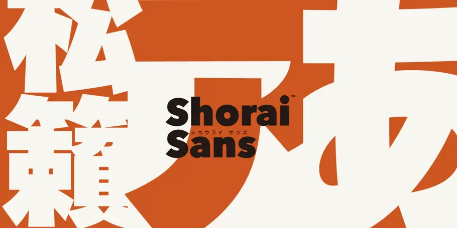
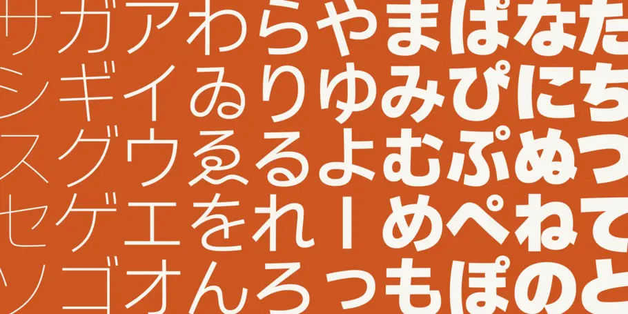
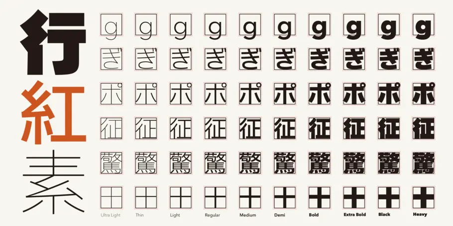
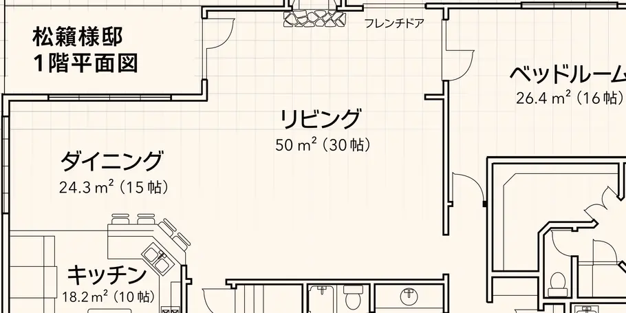
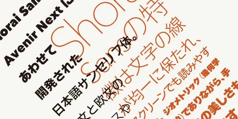
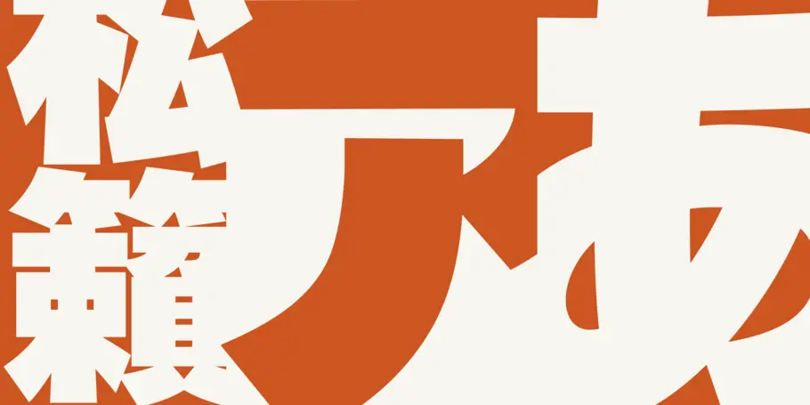
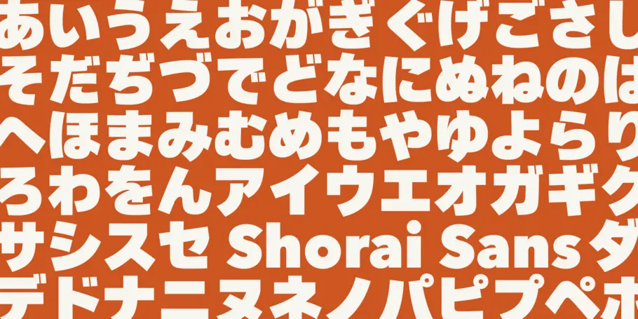
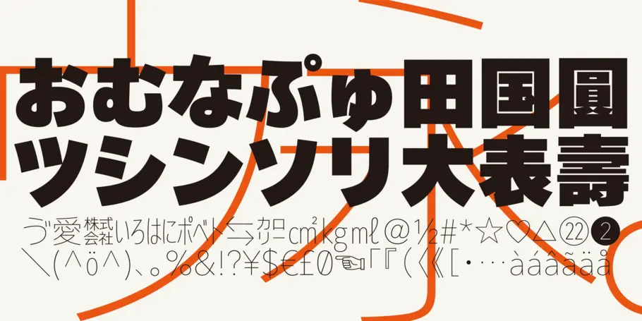
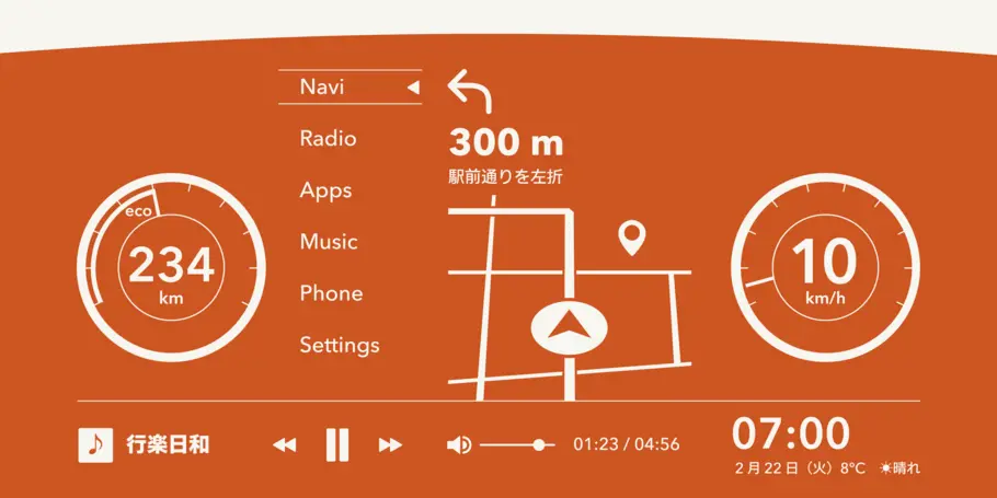
Shorai™ balances the subtlety of traditional hand-drawn brushstrokes with clean, geometric outlines. An intellectual-looking sans serif, Shorai’s simplified letterforms and vast weight ranges provide creatives with a holistic branding solution.
Shorai Sans was designed as a companion typeface to Avenir® Next, built to work harmoniously in modern global designs, while preserving the essence of Japanese handwriting.
Shorai goes beyond existing Japanese sans serifs to provide a wide spectrum of expression and personality for designers to play with. Shorai® Sans is opening new horizons in Japanese typography.
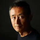
Creative Type Director Akira Kobayashi has three decades of experience, with an extensive background in Japanese typeface design and a deep understanding of calligraphy. After studying at Musashino Art University in Tokyo for four years, Akira Kobayashi accepted his first job at phototypesetting manufacturer Sha-Ken Co., where he was involved in the lengthy and intricate process of designing Japanese fonts.
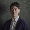
Ryota Doi is a Type Designer for Monotype. Ryota first became interested in type as a design student while at university in Japan. After receiving his BA in design from Tokyo University of the Arts, he enrolled in the MA typeface design program at the prestigious University of Reading, where he studied the differences between Japanese and Latin type.
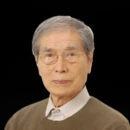
Mr Yukihiro Nakamura is a legendary type designer in Japan. In the Japanese type design field, there was a seismic shift in the 1970s. Mr. Nakamura is responsible for this change that we can almost refer to as paradigmatic.
We offer a number of ways for you start using Shorai Sans.