


Mind Meridian
A new typeface brings digital clarity to Mind’s mental health mission
A new typeface brings digital clarity to Mind’s mental health mission
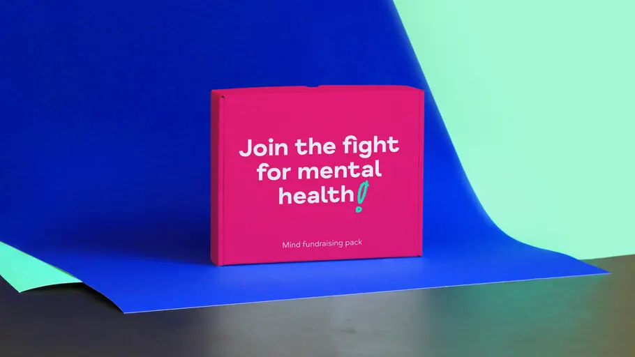
After years of campaigning to improve awareness and understanding around mental health, the time had come for charity Mind to update its iconic visual identity. In partnership with agency DesignStudio, Monotype Studio developed Mind Meridian – a modified typeface which puts warmth and accessibility at the heart of the brand.
Background.
After years of campaigning to improve awareness and understanding around mental health, the time had come for charity Mind to update its iconic visual identity. The ‘squiggle’ logo is widely recognised in England and Wales, but social media and other digital spaces were creating new demands on the organisation. In partnership with agency DesignStudio, Monotype Studio developed Mind Meridian – a modified typeface which puts warmth and accessibility at the heart of the brand.
Brief.
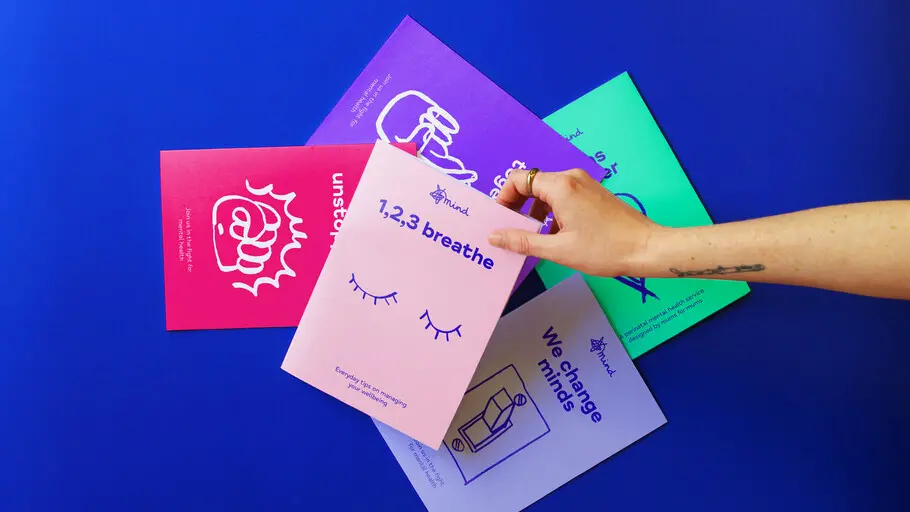
The organisation, which is the largest mental health charity in the UK, was previously using several different fonts – acquired over a number of years and in varying styles – which were now facing new accessibility demands. Making the brand more accessible to the diverse audience Mind serves was a huge part of the brief for the new typeface and design system, which also needed to be easy for volunteers and local Mind organisations to work with, regardless of whether they had design experience or not.
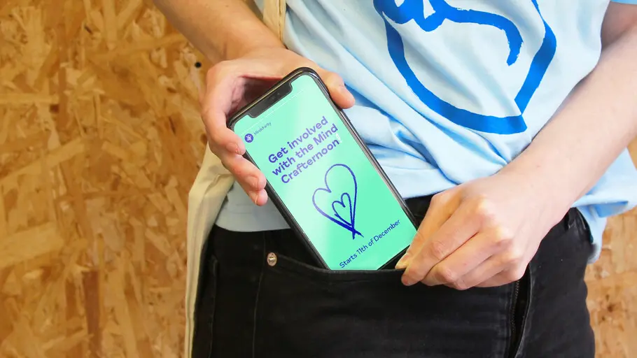
As with many other brands, much of Mind’s interaction now takes place online, making the digital realm absolutely essential for reaching the organisation’s audience. A key focus was updating Mind’s typographic palette to communicate clearly across these platforms, so the organisation could speak effortlessly through type. It also needed to build on the brand equity of Mind’s squiggle logo, which has always been a much-loved part of the brand.
Solution.
The organisation’s new typeface was designed to harmonise with this refreshed branding, retaining the vitality of the Mind squiggle while answering the functional needs of the organisation – in particular the accessibility requirements. Mind Meridian is legible for those with visual impairments, and has been tailored to sit comfortably alongside the local, handwritten executions of the organisation’s logo.
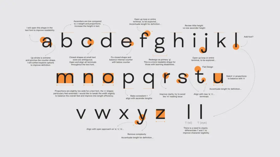
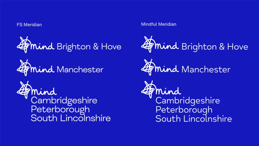
FS Meridian was the starting point for the design. Together with DesignStudio, the Studio team analysed its letter shapes and spacing, creating subtle changes such as narrowing proportions, opening character spacing, increasing ascenders and accentuating terminals — all to improve the “breathability” and readability of the typeface. These updates drew on extensive accessibility research already carried out by Monotype for brands including ING, RNIB and Mencap.
Result.
Aside from increased accessibility, Mind Meridian reflects a growing need for brands and organisations to adopt a more human approach to design. “Lots of companies have started to understand that they need to communicate in the most honest, authentic way possible,” explains Garnham. “It’s not about selling a product or service, it’s about being real. And in the past year we’ve definitely seen that trend.
Mind Meridian embraces where Mind is today, and allows the brand to flex its tone for the future, so the organisation can continue to fight for mental health without losing any of its much loved and trusted brand equity from the past.

Phil is a Creative Type Director and type designer with many years of experience in the design and engineering of fonts for global brands. Working in collaboration with design studios and global clients, Phil understands the creative and business needs of brands looking to build continuity with type.