Wolpe Fanfare™
The Wolpe Collection.
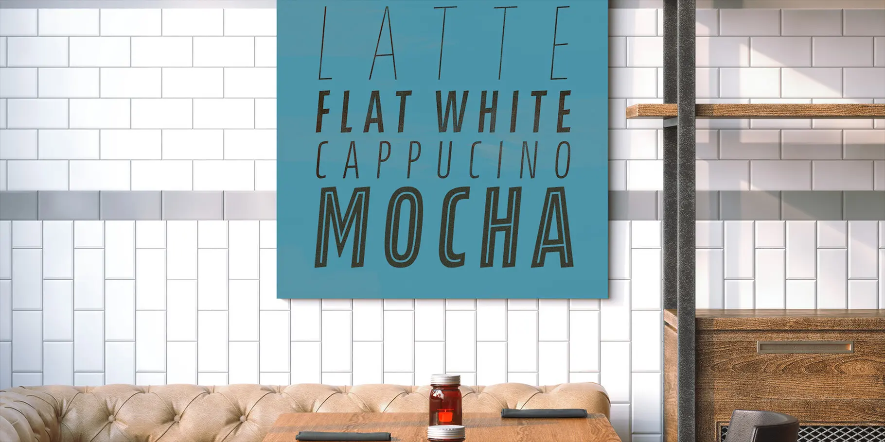
The Wolpe Collection.
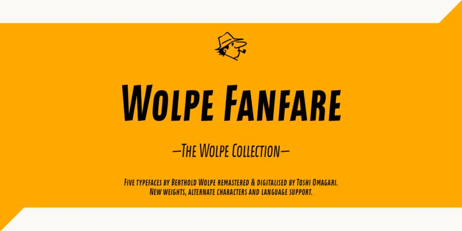
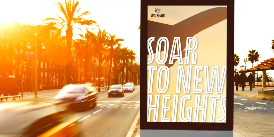
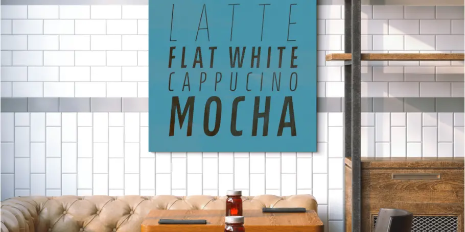
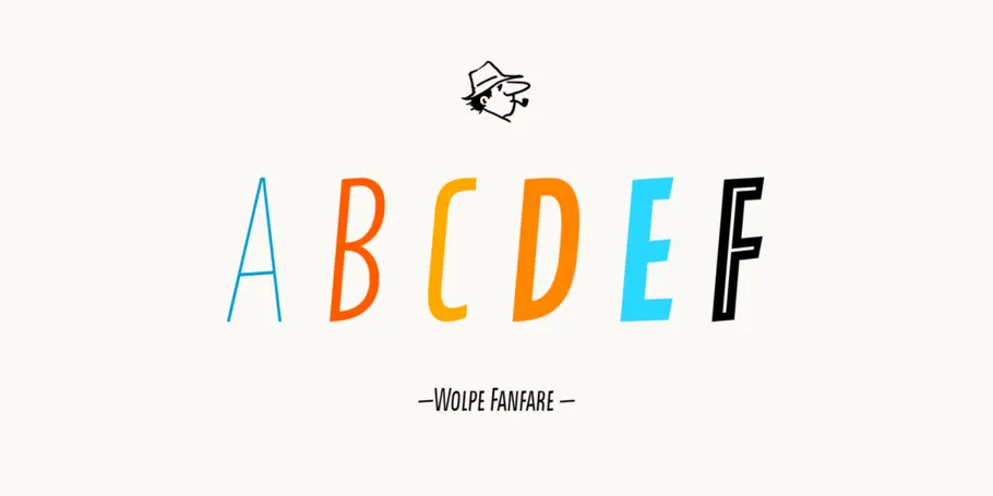
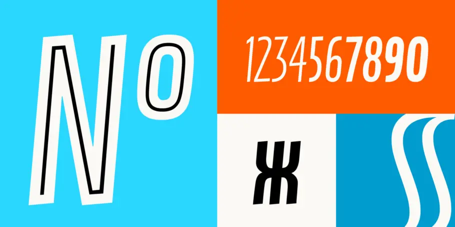
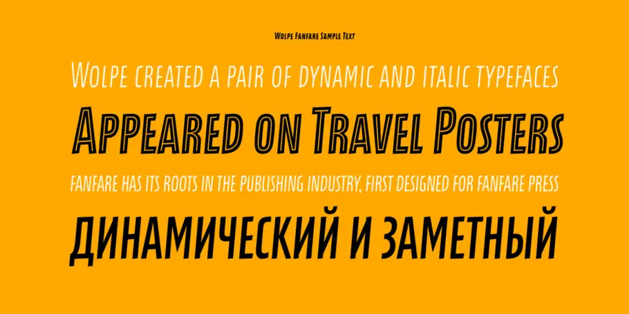
Wolpe Fanfare is part of The Wolpe Collection of typefaces, and displays an unmistakable sense of energy with an all-caps, sans-serif character set that leans forward, urging the eye forward. The Wolpe Collection celebrates Berthold Wolpe’s outstanding body of work, and includes five iconic typefaces, digitized and updated by Toshi Omagari of the Monotype Studio.
Diseñadores
Fundición tipográfica
Clasificación
Wolpe Fanfare is part of The Wolpe Collection of typefaces, and displays an unmistakable sense of energy with an all-caps, sans-serif character set that leans forward, urging the eye forward. The Wolpe Collection celebrates Berthold Wolpe’s outstanding body of work, and includes five iconic typefaces, digitized and updated by Toshi Omagari of the Monotype Studio.
Initially designed for Fanfare Press, the Fanfare typeface packed more into a small space than most typefaces. It was a natural for book and movie titles, and more general branding. “Fanfare is such a fun typeface,” says Toshi. “It was my happiest discovery when I was digging through the Monotype archive. I came across it and had to check the designer’s name.” No wonder: the Fanfare typeface, brimming with energy and optimism, is not a style you’d immediately associate with Berthold Wolpe, who best known for Albertus. Albertus is serious, classical and monumental, while Fanfare is modern, light and playful.
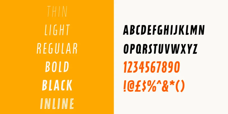
Eighty years on, the Fanfare typeface needed to be digitized and updated to serve a full range of modern applications. Toshi designed six weights - light, thin, regular, bold, black and inline - all of which preserve the character of the original letterforms. “I wanted to do more than digitize the original weight,” says Toshi. “It’s surprisingly modern, and its skeleton, its basic structure, is so beautiful.” To complete the Wolpe Fanfare font set, he added Greek and Cyrillic characters.
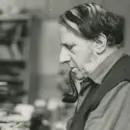
Berthold Wolpe helped shape graphic design in post-war Europe. His book jackets, with their intense colour and vivacious typography, were way ahead of their time, and his Albertus® typeface continues to be widely admired and used by designers today.

With a focus on multilingual typography, Senior Type Designer Toshi Omagari has created fonts for several major brands and worked on some of Monotype’s most recent major type releases. He is a regular speaker at events like ATypI, sharing his experience and insights on multilingual type design.
We offer a number of ways for you to start working with our typefaces.

If you want to license Wolpe Fanfare to use with your brand or project we can help you.

An all-in-one solution for font discovery, expertise, collaboration and management.

If you want to purchase a single weight or the entire Wolpe Pegasus font family with a range of licencing choices.
La familia de fuentes personalizadas de H&M transmite su estilo a todas las comunicaciones de la marca, desde los elementos visuales grandes de las tiendas hasta las tipografías pequeñas del sitio web.

Con un tipo de letra que se desenvuelve con la misma eficacia en las pantallas y las camisetas que en el televisor y las tablas de clasificación, la nueva identidad de la Premier League se convirtió en una de las mejores renovaciones de imagen de 2016.