Type Faces: Meet Anna Damoli.
Spotlights
Spotlights
Type Faces: Meet Anna Damoli.
Welcome to our Type Faces series, where we’ll be sharing the stories of some of the fabulous people behind the type here at Monotype. From all around the globe and across the organization, our Monotype colleagues truly prove that, like Charles Nix, Senior Executive Creative Director at Monotype, always says, “We are ALL creative.”
For Anna Damoli, creativity is less a choice than a reflex. Whether she’s sketching letterforms, sewing her own clothes, or roller skating, she’s always building or learning something from scratch. “I’m a maker,” she says. “I love that feeling of starting with nothing and bringing something into the world.” Read on to learn more about Anna.
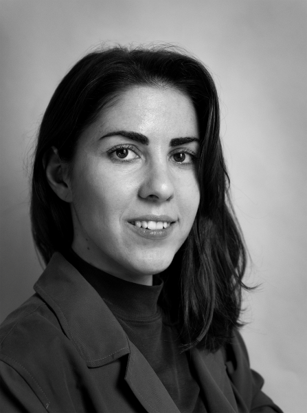
A portrait of Anna.
How did you approach your creative education?
I first studied industrial design, but I realized I wasn’t into product design. That led me to graphic design, and from there I fell in love with calligraphy and type design. It started as a side thing; I would take courses on weekends while working full-time in branding.
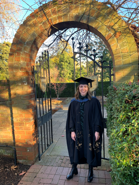
Eventually, I decided to make the jump. I quit my job, moved to the UK, and got my Master of Typeface Design at the University of Reading. That was a big shift, but I knew I wanted to focus on this full time.
Anna at her graduation from the University of Reading.
So, calligraphy was a turning point. How did that evolve into type design?
Calligraphy was such a discovery for me. It’s slow, meditative, and you can see your own personality in the work.
That gradually brought me closer to type design. Then I went to Reading, where the program was very research-driven. I had no proper academic research experience before then, so that was a beautiful challenge. They gave me the structure to write, cite, organize my thinking. It taught me a different way of learning, and that stayed with me.
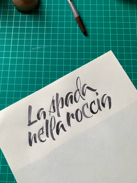
A sample of Anna’s calligraphy: “la spada nella roccia” in Italian or “the sword in the stone” in English.
What do you love most about being a typeface designer?
Typography is the unique intersection of drawing, technical expertise, deep historical knowledge, and creativity. It combines all the things I love.
And the team at Monotype is incredible. I learn so much from them — they’re so generous with sharing knowledge. I’m a little obsessed with learning. That’s my thing.
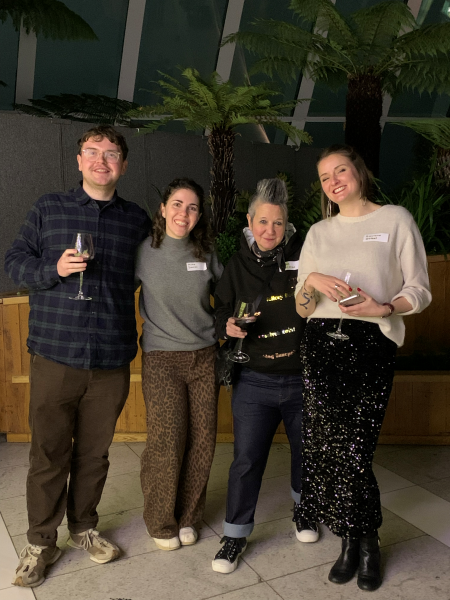
Anna and her Monotype colleagues.
What’s one project you’re especially proud of?
One of the first projects I ever worked on as a typeface designer involved creating a semi-connected script typeface for a social media app. Later, I got to design two more for the app — one monospaced and one rounded.
My team at the time knew I loved calligraphy, so I got to lead that project and handle the engineering, too. The goal was to make these fonts feel random and human, almost like real handwriting. And then I started seeing them everywhere. That was the best feeling.
What’s a font you love?
Halyard from Darden Studio. It’s a workhorse of a font. It’s very functional yet has a human feel. I used it extensively in my master’s program — specifically for taking notes and for my dissertation drafts.
Outside of work, what drives your creativity?
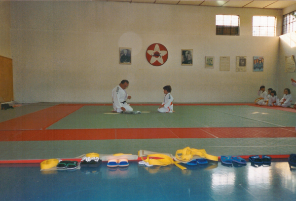
I get really into different hobbies — judo, bookbinding, sewing, crochet. I’ve been doing judo since I was five years old; I have a black belt, and I even teach it now.
Anna practicing judo at her first dojo around 2002.
I love sports. People are always surprised because type design seems like such a nerdy job. But I teach judo, I skate, I run. During the pandemic, I got really into roller skating. There’s this whole jam skating culture that’s super creative and social. I even went to a big festival in Barcelona with people from all over the world. And I skated at Roller Nation in London with Spike Spondike!
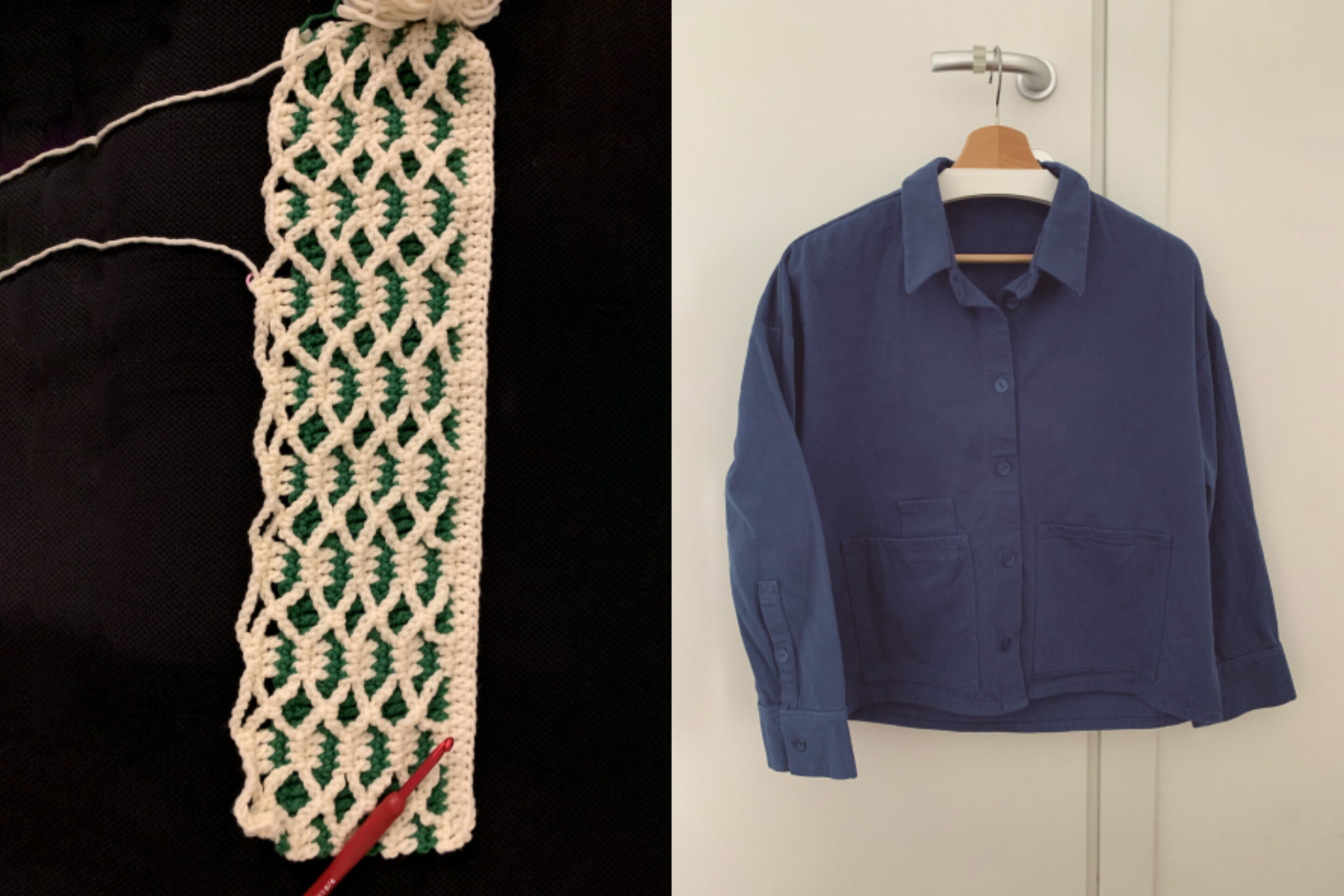
At the moment, I’m very into crochet. I’ve realized I like crafts that are a little less about authorship. With crochet or sewing, you follow a pattern, maybe choose the colors, and that’s enough. There’s no pressure to reinvent the wheel. It’s freeing, especially when your job is all about creative output.
Two of Anna’s recent craft projects, crochet (left) and sewing (right).
I’m also really into reading about women in typography. Women are often connected to calligraphy, as it’s seen as a feminine discipline, but less so to sign painting, typography, and type design, which are seen as male-dominated disciplines. So, I’m interested in discovering more about their role and contribution to those industries.
There’s this book, The Natural Enemies of Books: A Messy History of Women in Printing and Typography, that looks at the history of women in printing and type. A lot of it is hidden history. And I’ve had a lot of female mentors. Representation really matters. It made things feel more reachable for me.
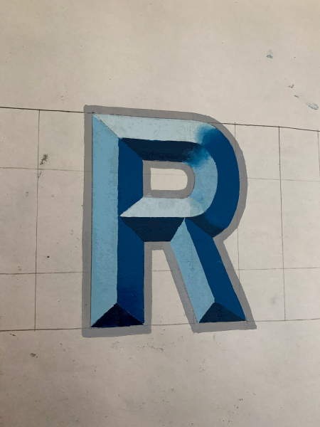
An example of Anna’s sign painting work.
I also love sign painting. That started recently, after years of wanting to try it. I took a few workshops and finally got into it. It’s so different from digital type design — imprecise, personal. You can see the brushstrokes. It reminds me of calligraphy in that way.
That tension between precision and personality seems important in your work.
Yes! In type, things have to be pixel-perfect, especially when you’re working on production. But with sign painting and calligraphy, you can be expressive and imprecise, which actually adds value to the work because it shows the humanness in it. I think you can see it in a font when the designer has done calligraphy or other handmade work. It shows up in their type design, even subtly.
What inspires you?
My parents have been a big inspiration.
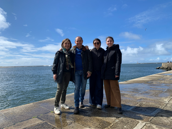
Anna (right) with family.
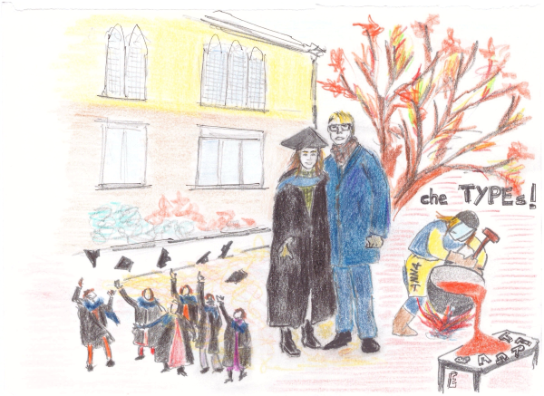
They work in totally different fields from me, but they both love what they do. My mom is a therapist, and my dad isn’t in a creative job, but he’s very creative in life. Every year he makes an illustrated recap of each family member’s year for St. Lucia’s Day — like a little visual history. He doesn’t do that for work, but it’s his way of bringing creativity into life.
The illustrated recap of the year Anna graduated from the University of Reading, drawn by her father.
Do you have other family traditions that stand out?
Yes — bad birthday poems! Every year, whoever isn’t the birthday person collaborates to write a silly, rhyming poem that hints at the gift. They’re always last-minute, full of inside jokes, and we read them out loud before opening presents. I always get nominated to handwrite them.
We’ve done it for years, even remotely when we’re in different places. It’s such a joyful thing — ridiculous, but heartfelt.
Do you live close to your family?
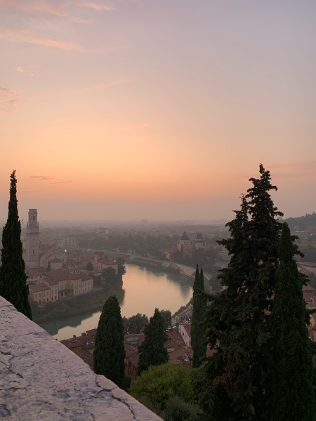
Right now, I’m in Verona, Italy, which is my hometown, but I’ve lived in London and Milan, too.
Verona, Italy.
When I was younger, I couldn’t wait to leave Verona. Now I see the beauty in it. It’s quiet, peaceful. Living abroad helps you understand what you love and what you miss. Even if you love a place, it’s never quite like home.
Is there anything you collect to make your home feel more “you”?
My partner and I started collecting snow globes. It was inspired by my dad, who has this shelf full of weird, kitschy souvenirs that we lovingly call “the horror gallery.” We have to limit ourselves, but we try to get one from every place we visit. Once we were in India and couldn’t find one, and so instead our friend brought us back this glass ball that lights up to add to our collection. It’s strange and beautiful at the same time. I love it.

Type Designer
Anna Damoli.
Anna Damoli is an Italian type designer and calligrapher at Monotype. Before joining Monotype, Anna worked at Colophon Foundry in London, where she led a wide range of projects, including the development of library releases and bespoke typefaces for iconic global brands.


