Type Around the World – Get to Know Stockport, UK
Spotlights
Spotlights
Type Around the World – Get to Know Stockport, UK
In this recurring feature in our “Fonts Having a Moment” series, we’ll be exploring cities around the world through the dual lenses of culture and typography, guided by our friends at Monotype and some of our partner foundries. Join us on this exciting virtual journey!
This time, get to know Stockport, UK with Alister Shapley of Applied Systems Design Studio.
A portrait of Alister.
Tell us a bit about yourself and your foundry.
My name is Alister Shapley and I’m the founder of Applied Systems Design Studio, where we specialize in brand and type design services. I opened the studio in 2024 after more than a decade within the design sector working on a variety of projects, primarily within the architectural and placemaking sector.
It would be wrong of me to say that I’ve always had a passion for type; I only really started to fall in love with it during my studies in Architecture at Edinburgh College of Art. A conversation with my granddad sparked the interest. While showing him some of my university work, I remarked that “everyone just uses Helvetica,” to which he responded by pulling out his old typography books and catalogues from his time as an art director. That moment led me to change careers, and I’ve never looked back since.
Tell us about your city. What do you love about it? What’s distinctive about it?
Stockport, like Manchester, was part of the Industrial Revolution and was very much a working-class city.
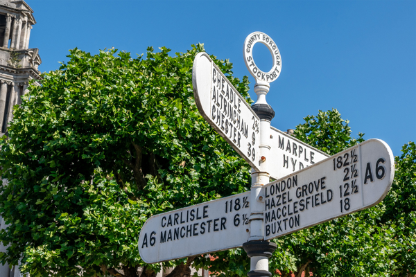
Wayfinding signage in Stockport.
Its main export was textiles, specifically hats.
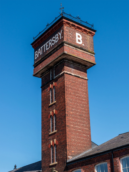
The former Battersby Factory, recently renovated into modern housing.
It’s gone through many changes: industrial booms, wartime bombing, under-investment, and now a creative resurgence (which is leading to gentrification). Because of all these changes, the urban landscape is a real hodgepodge of eras.
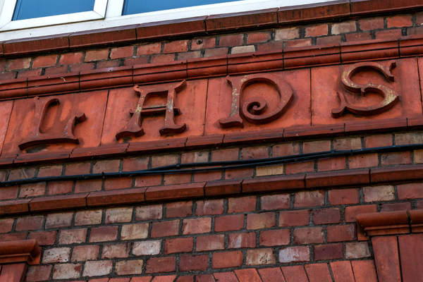
Architecture ranges from Underbank Hall, a sixteenth-century townhouse (now a bank), to Industrial Revolution-era factories, to 1970s brutalism. This mishmash of architectural styles also brings a mass of typographic delights.
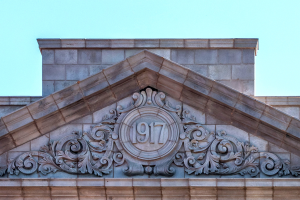
Architecture in Stockport spans centuries.
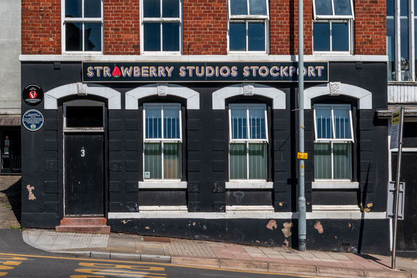
Stockport does not shy away from creativity. While fashion helped kickstart Stockport’s urban sprawl, it was music and art that kept its spirit alive. Plaques around the city now celebrate its musical legacy, preserving the memory of dance halls, Northern Soul discos, and the famous Strawberry Studios that had the pleasure of hosting recording artists such as Joy Division, Neil Sedaka, Barclay James Harvest, the Smiths, the Stone Roses, the Moody Blues, Paul McCartney, Wax, Phil Collins, and Cliff Richard.
The iconic Strawberry Studios.
With a lot of underinvestment, and Manchester being next door, Stockport has been overlooked. This is changing. Artists, designers, and print studios are popping up, bringing the city’s creative heritage back into the spotlight. Music, coffee, art, and excitement are in abundance — once you know where to look. Gigs in car parks, ceramics studios at the back of coffee shops, back-alley cocktail bars, and outdoor food markets signify a city on the rise. It’s changing rapidly now, but in a way that honors its red brick factory identity while not shying away from a more modern attitude.
A classic red brick building in Stockport.
All this activity and heritage is a hotbed for typography experimentation.
Where would you take someone visiting your city for the first time to explore its creative heart?
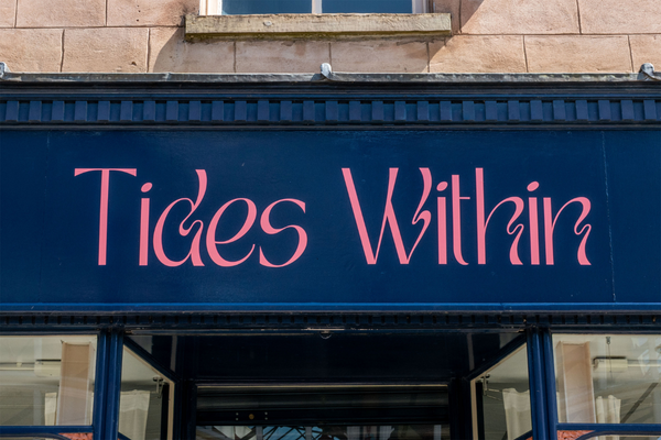
The Underbank and Old Town are where most of the new and more experimental shops, restaurants, and cafés are.
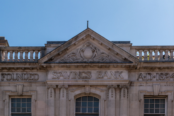
The Stockport Savings Bank was formed in 1824 and originally operated out of a room in Underbank Hall. The bank later built and moved into this building in 1913.
The Underbank is still in development, with construction work replacing dilapidated or collapsing buildings, yet the street is crammed with bars, record shops, bakeries, cafés, and independent retailers.
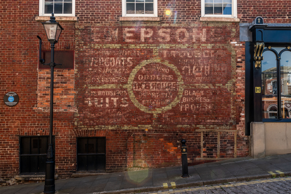
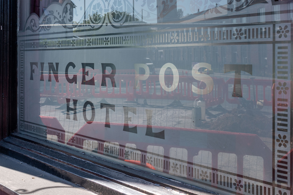
Contemporary and historical typography commingle in Old Town.
When I was growing up, my mum always took me to Magma in Manchester. A fantastic shop filled with magazines on design, architecture, and art — none of which I’d never seen before, but eagerly devoured whenever we visited.
It closed in 2020. This sad event led the way for Rare Mags in Stockport to open its doors. One of the best arts and design bookshops around, it’s a regular stop for me when I need some inspiration. Rare Mags has been leading the change to Stockport’s center. While many of the main high streets are in decline, the Underbank is thriving, and Rare Mags is playing a big part in that.
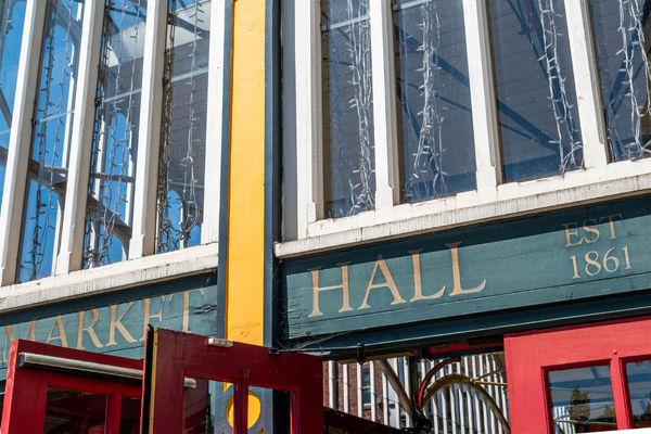
The Market Hall is the focal point for Stockport’s Old Town.
Market Hall.
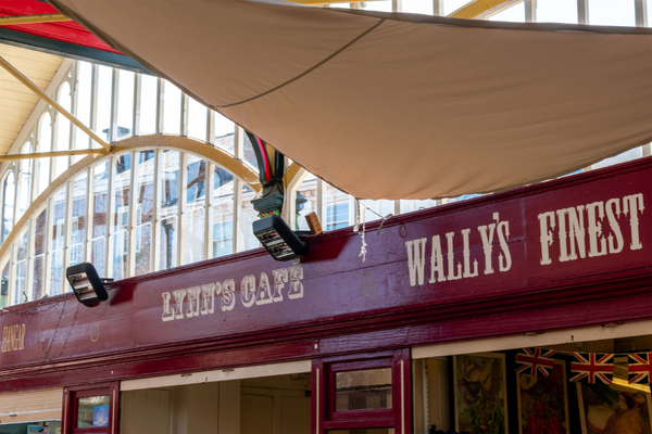
All sorts of stalls reside inside, from bookshops and wine bars, to an incredible Polish bakery and local grocers. Each stall has a set red wooden façade and cream lettering, but beyond that, it’s a free-for-all. The red and cream color scheme brings consistency, while the variety of typefaces adds playfulness and joy to the incredible Victorian landmark. The creativity even spills out onto the surrounding streets, with food markets and other events taking place throughout the month.
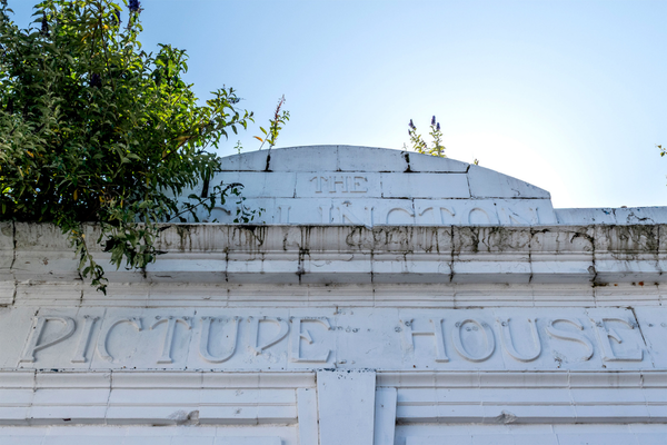
While these areas are in the center, some of the more interesting pieces of typography are within the wider areas. It’s worth a walk around as Stockport still has a lot of secrets to discover.
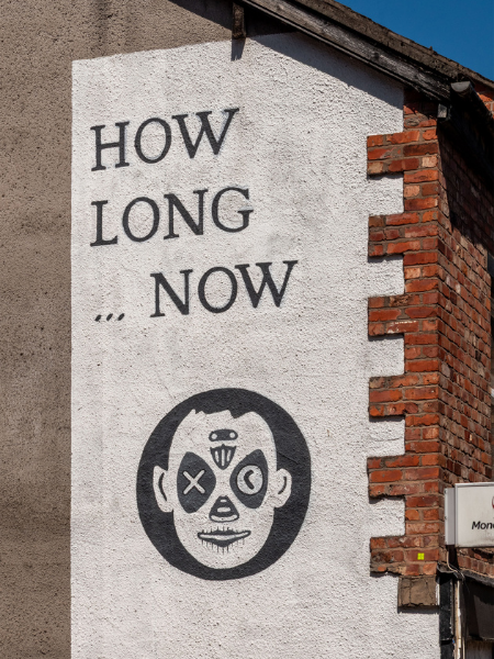
Beautiful typography abounds outside of Old Town and the Underbank, too.
What’s a typeface that you think represents the spirit of your city and why?
This is a hard question, especially with the variety of typefaces and eras represented throughout Stockport. But for me, one typeface that seems to represent that area would be Clarendon.
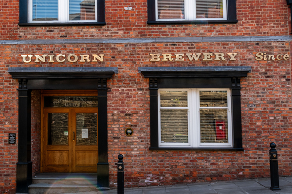
The Unicorn Brewery’s sign, featuring Clarendon.
Even though it was originally released by a London foundry, its classic British design can be seen on many signs across Stockport. From parks to breweries, Clarendon has been used all over.
Clarendon can be found all over Stockport’s signage.
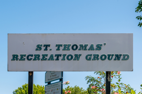
Its Victorian yet modern appearance links closely with Stockport’s urban aesthetic. It might also be because the park sign that I stare at from my house is set in this. And even though weathered and a little tatty, it’s still wonderful!
A park sign set in Clarendon near Alister’s home.


