How LA28's "Unapologetically Type-Forward" Approach Nailed Olympic Branding
Thought Leadership
Thought Leadership
How LA28's "Unapologetically Type-Forward" Approach Nailed Olympic Branding
Every city that hosts the Olympic brings its own unique flavor the event’s accompanying branding. It’s an opportunity to infuse civic, national, and cultural visual identity into an established international template. For the 2028 Summer Olympics, Los Angeles has chosen an exceptionally bold, type-forward design that plays with variable glyphs and four unique typefaces that speak to the city’s diversity.
The LA28 identity draws clear inspiration from city’s street signs and unique neighborhoods, while staying constantly in movement. Charles Nix, Senior Executive Creative Director at Monotype, spoke with Creative Bloq about how the team behind LA28 successfully employed typography as a star player in this brand identity. Read the full interview here at Creative Bloq.

Global Head of Creative Strategy
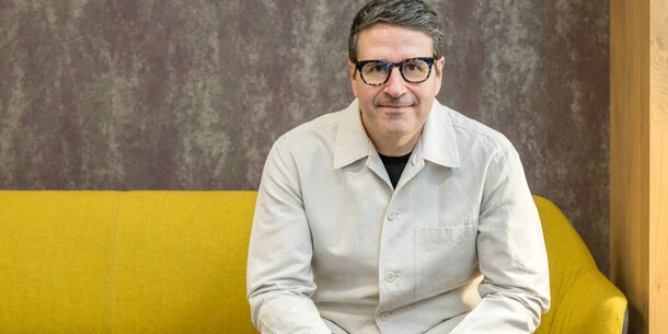
Charles Nix.
Charles Nix is Global Head of Creative Strategy at Monotype, a designer, a typographer and an educator. He was lead designer for Helvetica Now and has designed a number of popular typefaces in the Monotype Library, including Walbaum and Hope Sans, which received a Certificate of Typographic Excellence in the 22nd Annual Type Directors Club Typeface Design Competition.