Type Around the World – Get to Know Barcelona, Spain
Spotlights
Spotlights
Type Around the World – Get to Know Barcelona, Spain
In this recurring feature in our “Fonts Having a Moment” series, we’ll be exploring cities around the world through the dual lenses of culture and typography, guided by our friends at Monotype and some of our partner foundries. Join us on this exciting virtual journey!
This time, get to know Barcelona, Spain with Magdalena Arasanz of W Type Foundry.
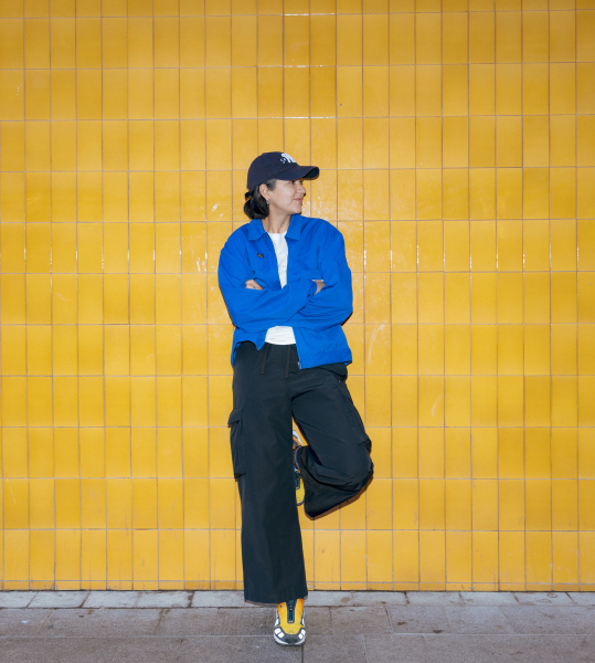
A portrait of Magda.
Tell us a bit about yourself and your foundry.
I’m Magdalena Arasanz, designer and co-founder of W Type Foundry. I grew up in Santiago, Chile, and am now based in Barcelona.
I was always a creative kid; I loved drawing and building little things. My dad used to paint and do carpentry as a hobby, so he had a workshop full of tools and weird things, which was the perfect playground for a kid like me.
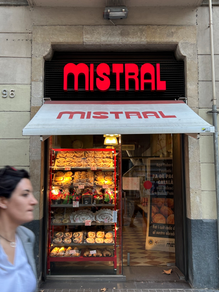
Mistral, a bakery in Barcelona.
When I was older, I was drawn to advertising for its mix of playfulness, strategy and design. It was while working in advertising that I completely fell in love with typography and with the power that letterforms can have within a message.
Then I learned type design was something you could actually study! I was instantly hooked. I enrolled in a postgraduate program in type design in Chile, and that’s where I met Diego and Patricio. Shortly after, in 2016, we founded W Type Foundry together.
Over time, my role naturally shifted more towards the direction of the foundry, working closely with clients, building relationships, and shaping how we grow as a business. Collaborating with designers and brands around the world has given me a very hands-on understanding of how typography lives inside real projects, not just as a design choice, but as a core part of how brands communicate.
Tell us about your city. What do you love about it? What’s distinctive about it?
What I love about Barcelona is its constant energy. There’s always something happening, and every neighborhood has its own character, traditions, local life, and parties. Centuries of history and different cultures mix and it manages to keep a contemporary spirit. At the same time, it’s an easy city: you can move around by bike, live at a human scale, and still be surrounded by culture, design and creativity.
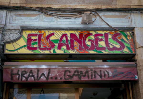
Classic stained glass signage meets modern graffiti.
The sea is right in the city. I love the summer weather and going to the beach, so that’s a huge plus for me! Also, Barcelona is surrounded by nature, forests, and mountains, and people love to hike here. Montseny, in particular, is my favorite place to escape.
Where would you take someone visiting your city for the first time to explore its creative heart?
I would take them around Sant Antoni and Eixample.
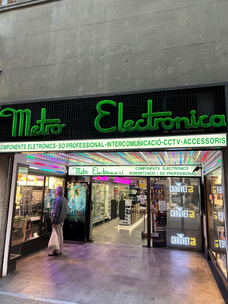
An audio store in Sant Antoni.
For me, they’re close to the city center but still keep a strong neighborhood feel — with lots of local shops, traditional businesses, and a rhythm that feels more authentic than the very touristy areas.
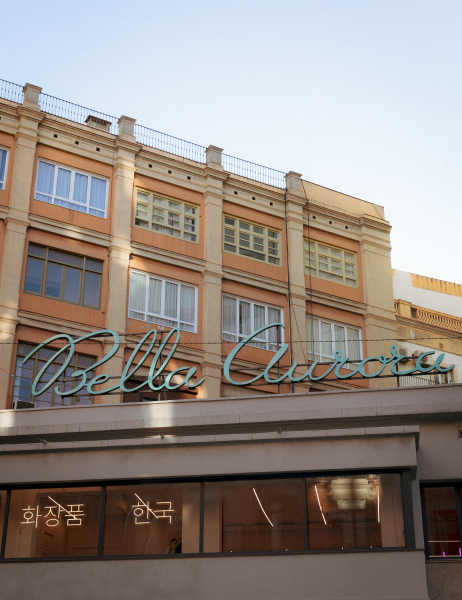
Bella Aurora in Eixample.
I would definitely include El Raval as well. Once on the edge of the old city walls, today it’s one of the most multicultural areas of Barcelona, with strong South Asian and North African communities, narrow streets, a good amount of chaos, sketchy corners, small bars, and many independent, punky, non-commercial design and creative spaces. And some of my favorite places: second-hand shops where you can always find little treasures.
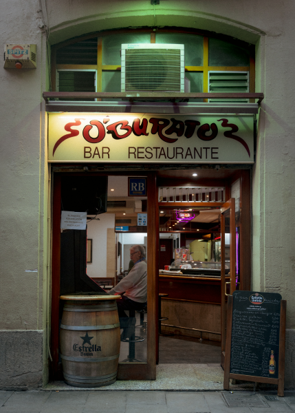
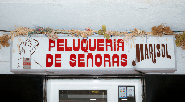
Unique typography at O’Burato Bar in El Raval.
Finally, I’d take them to El Poblenou. It feels very different from the rest of the city, more open and spacious. It used to be an industrial area, full of old warehouses and factories, and today many of those spaces have become creative hubs, studios, and design offices.
I have two favorite spots you cannot miss: first, Els Encants flea market, one of Barcelona’s oldest flea markets, totally chaotic and amazing! You can find everything from antiques and vintage clothing to furniture, from collectibles to completely random objects.
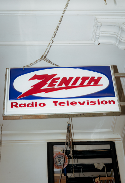
A second-hand store in Barcelona.
And right across the street, the Museu del Disseny, which is just a lovely museum, with a permanent furniture design exhibition that I really like and a couple of permanent exhibitions on posters and graphic design history that are worth the visit.
What’s a typeface that you think represents the spirit of your city and why?
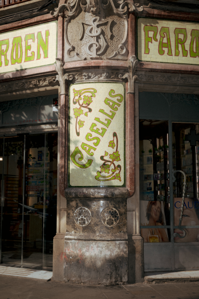
That’s honestly a hard question! I feel my perspective might be a bit biased compared to someone who was born and raised here. I think the type that represents Barcelona best is the one influenced by the Catalan Modernism movement, which is so deeply present in the city’s architecture and visual history and includes art nouveau-style letters, organic shapes, movement, decoration, and ligatures.
This pharmacy in Raval uses Art Nouveau-style signage.
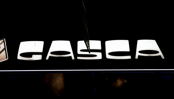
I also associate Barcelona with high-contrast typefaces, whether that contrast appears in the horizontals or the verticals (and often stretched in extreme ways).
The men’s fashion store Gasca uses a high-contrast typeface for its signage.
I think it’s more of the city’s contemporary look though, with bold, dramatic letters. Both styles coexist, one representing the classic and the other the modernization of the city.
More modern, high-contrast type in Barcelona.


