Macklin™
歴史に着想を得た、現代のための書体

歴史に着想を得た、現代のための書体
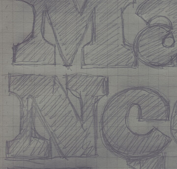
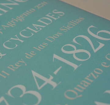
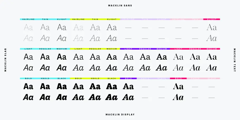
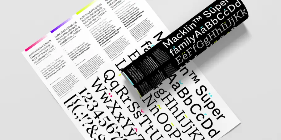
Macklinは、活字が本の世界から飛び出し、大型ポスターや広告に躍り出るようになった産業革命時代に発想を得た書体です。ベースのクラシック書体に独自の解釈が加わったMacklinは、シャープでありながらエレガントな表情が特徴です。スーパーファミリーとして、現代のさまざまな用途、デザインに適しています。Macklineは4つのサブファミリーとhairlineからblackまで9ウェイト、54フォントを用意し、幅広い用途に対応ができます。
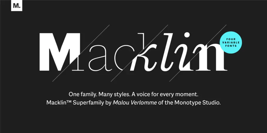
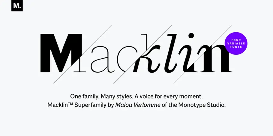
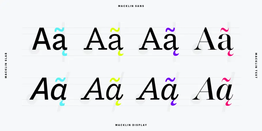
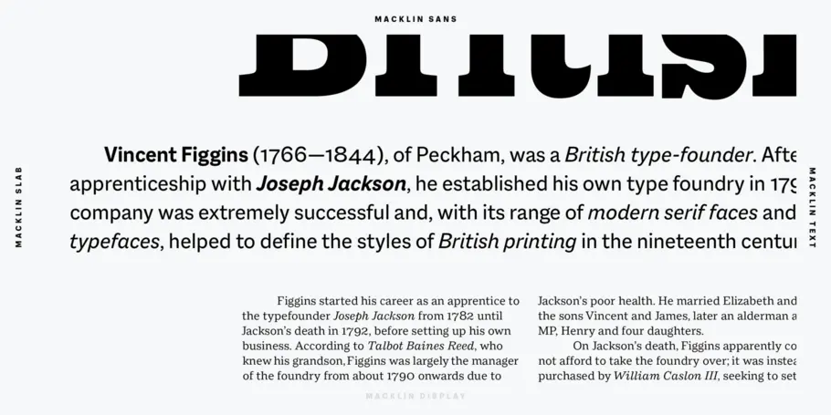
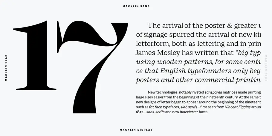
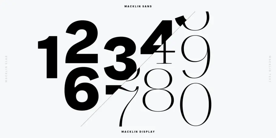
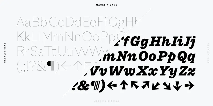
The concept for Macklin began with research on historical material from Britain and Europe in the beginning of the 19th century, specifically the work of Vincent Figgins. This was a period of intense social change--the beginning of the industrial revolution. A time when manufacturers and advertisers were suddenly replacing traditional handwriting or calligraphy models and demanding bold, attention-grabbing typography. Typographers experimented with innovative new styles, like fat faces and Italians, and developed many styles that brands and designers continue to use today, such as slabs, serifs, and sans serifs.
Verlomme pays respect to Figgins’s work with Macklin, but pushes the family to a more contemporary place. Each sub family has been designed from the same skeleton, giving designers a broad palette for visual representation and the ability to create with contrast without worrying about awkward pairings. With Macklin, Verlomme shows us it’s possible to create a superfamily that allows for complete visual expression without compromising fluidity.

Malou Verlomme is Senior Type Designer for Monotype, and has been with the company since 2016. His Camille typeface has the honor of being part of the collection at France’s Centre National des Arts Plastiques (CNAP).
We offer a number of ways for you to start working with our typefaces.


